A transformative force who evolves digital products alongside their companies with a combination of strategic design and deep empathy for users, creating great design that isn't just about aesthetics—it’s about solving real-world problems and enhancing the lives of people.
CCL: a tracking app for people with menstrual cycles
Product Design for Calendar and Data Display
Overview
CCL is an app meant to track menstrual and ovulation cycles with the goal of helping everyone with their monthly tracking needs. Whether a person wants to become pregnant, is hoping to avoid pregnancy, or just wants to track their menstrual cycle the CCL app will help.
Role: Lead Designer, Part of a Cross-Functional Team
Sector: SaaS, B2C, FemTech, Period Tracker App
Time: 12 Weeks
User Group: Women aged 25-45 looking to become pregnant, avoid pregnancy, or track their menstrual cycle
The goal of this design was to bring out a playful, warm, and comfortable side to the menstrual cycle. They wanted to help those with periods find peace in an app that can track it for you.
The client wished to avoid something too juvenile or something that looked too much like other period tracking apps on the market. They also needed the app to work for several different user groups. Although their primary user group is women looking to become pregnant, they also wanted their app to work for women looking to avoid pregnancy via tracking, and those who just wish to track their cycle.
CCL already had an existing app, and an existing client base, so it was also important to update functionality without confusing existing users. Their existing app was lacking any styling, as they had only been using it with user groups to find data and test their system.
Main Takeaway: a new, playful, comfortable, and feminine style was needed immediately for their product.
Lofi Mockups
Iterations
Initial hifi design iterations (above). Second pass design iterations (right).
High Fidelity Mockups
Designed in Figma, the overall design features a softer color palette. While it’s very feminine we wanted to avoid it being too juvenile, opting for an orange/pink scheme rather than an entirely pink scheme. The color palette was extremely important to get right. The green from the background elements also appears in many buttons to be able to diversify the styling for many types of buttons and alerts.
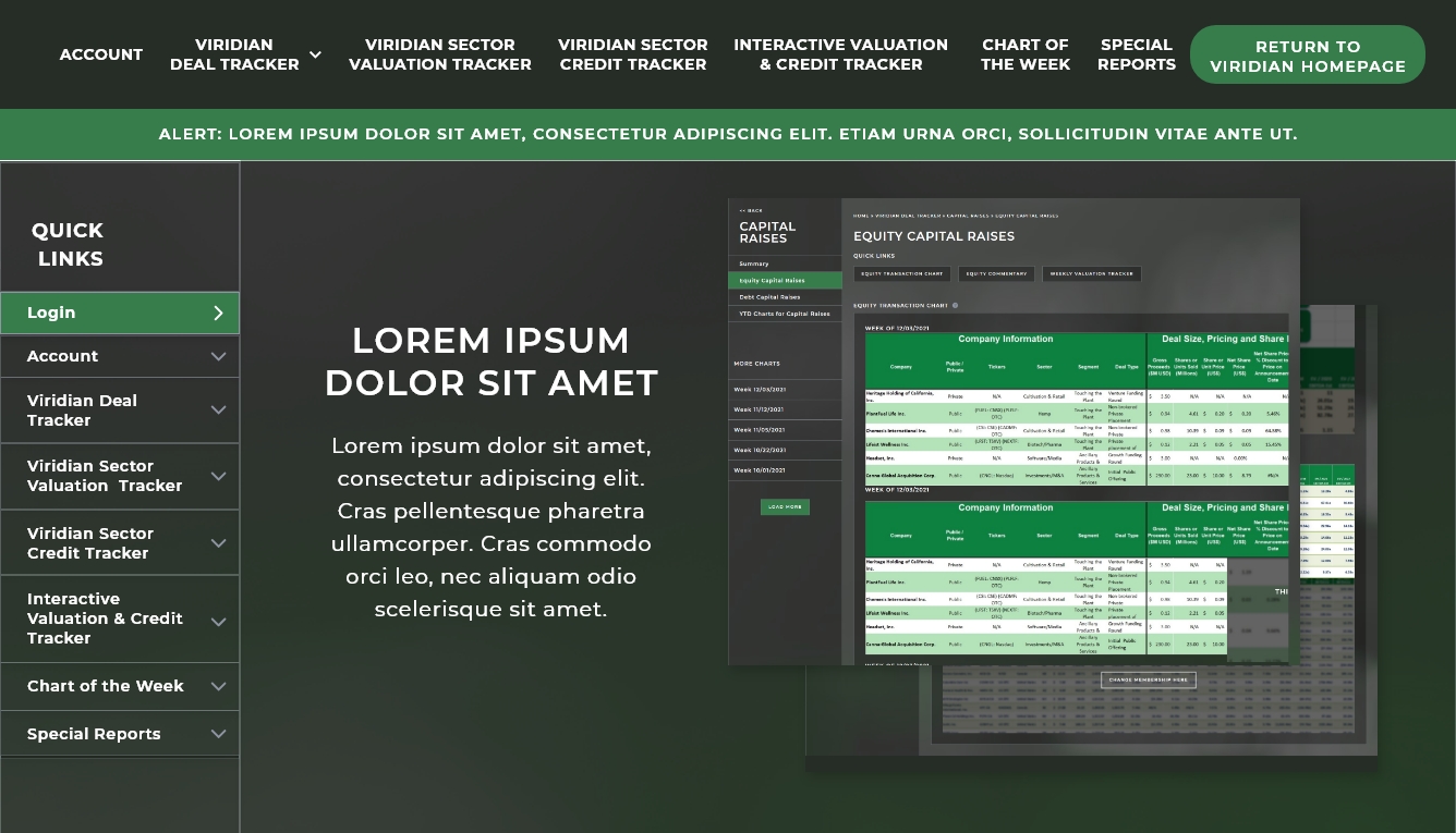
While the full design mockups are not available to showcase due to the company’s request, I have pulled in several of the designed screens into a separate mock-up for viewing.
The most important element, and the element we started with was the homepage and period tracking form itself.
On the homepage the calendar needed to have several different color options with different meanings for each one. In a normal period tracker there might only be the colors for the current day and then for the period itself, with slight variations for light/regular/heavy bleeding. I included all three colors in the pink variation. For this app we also needed to include ovulation days so that those trying to get pregnant or trying to avoid pregnancy could get that additional functionality. I opted for the orange color to help differentiate it from the menstrual cycle. The current day I changed both shape and color to differentiate it from the other elements.
The phase tracker was the next most important element for those trying to get pregnant. It can be turned on/off in the settings depending on the user, since those using this as only a cycle tracker will have little use for the phases.
Below that it was important that the tracking was easy to access from the homepage since that was the primary functionality of the app. So I created the button “Enter Today’s Symptoms.” The client requested the wording of this button, so I tried to make it as clear as possible that it was a button and that it was important on the homepage.
More from the Portfolio:
CCL
SaaS, App Design Calendar Design, Hifi Design
ClinNexus
A clean, modern design for a SaaS in the healthcare industry
Caplinked
SaaS, Marketing Website Market Research, Competitor Analysis, User Research, Surveys, Persona Development, User Flows, Sitemap, Hifi Design
Caplinked: a Secure Way To Transfer Private Files
Bringing Product Design Into the Modern Era
Overview
Caplinked is a SaaS that allows businesses to securely manage confidential information, mergers & acquisitions activity, perform due diligence, and handle contract negotiations. Over 250,000 professionals from 75+ countries and nearly half of the Fortune 1000 companies use CapLinked to securely transfer files.
Role: Lead Designer, Part of a Cross-Functional Team
Sector: SaaS, B2B, Security, Data Transfer
Time: 12 Weeks
User Group: Businesses, Fortune 500 Companies, Finance, Law Firms, Venture Capital, Private Equity
Founded in 2010, Caplinked’s first-class software stayed up to date, but its design of the website and app hadn’t been updated since the start of the company. Rising competitors in the industry had newer designs that appeared more “tech savvy.” This risked Caplinked’s status as the industry leader.
Main Takeaway: a new, modern, tech-savvy, style was needed immediately for their website and product.
First Impressions
The website is very word heavy. Text is smaller than would be easily legible. Section widths are inconsistent in a way that feels unintentional. Callouts to existing clients are good and build consumer trust but should be focused on and highlighted near the top of the page. CTAs are limited, lacking interest and focus. There’s no real incentive for me to click on anything. There’s no way for me to preview the product except in a video in the top of the page, no images or other media that show me what this product is. Overall the design could be significantly better and more product focused.
The app leaves a lot to be desires. While hierarchy is generally pretty good, there’s places where it could be improved pretty significantly. Focus needs to be on what parts of the app users are most frequently utilizing and making sure those are easier and quicker to access. Styling looks much older than even the website. Colors are inconsistent as are icons, which can add to confusion from users. A lot of improvement could be made by updating aesthetic into something more familiar.
Because of the existing customers adjusting user flow will be difficult and should be limited to only extremely important changes. Changes to user flow should be small and gradual, coming in phases to help users keep up with changing design.
Discovery
Caplinked already had a large, existing user base to pull data from. Because they wanted both website and product to be updated we needed to interview customers about their needs for both.
The website’s primary function is to get new users to try the product. It’s secondary function is to help existing users find the answers to questions they might have about the product. Customers we interviewed agreed with this assessment.
The app’s primary function is to allow files to be transferred securely and easily. As security is primarily a development issue, my job was to focus on how the design of the product might effect the ease of use only.
Cross-Functional Team: For this project I had access to a project manager, a copywriter, an SEO specialist, and a development team. I also had access to three members of Caplinked’s team to help me gather data and insights as well as to connect me directly to their users, and provide me feedback as the process continued.
Competitor Analysis
A few takeaways:
Dropbox: Dropbox is a file-sharing giant in the industry. Their website features a lot of effective CTA’s. There are a lot of product images mixed in among the text. Their copy is shorter with lots of white space. Animations help lead the eye down the page. While the homepage utilizes a dark theme, the rest of the site still utilizes a light theme. The app is very clean with minimal color usage, only for the most important aspects. Icons and text menu adds clarity for both small and large window sizes. Features and file menus are separated, but on the same left side menu allowing for clarity and ease of use. The audience is slightly different. Caplinked can push its security features to capture the more specific audience.
Kiteworks: A significantly busier site style that still features effective CTA’s from the hero throughout the site. The site pushes starting with a demo, similar to Caplinked, and pushes the security features. Few images of the app are featured, to Kitework’s detriment. The app is similarly an older style as Caplinked’s is. This makes Kiteworks a more direct competitor, but an easy one to improve upon design-wise and gain more trust of similar clients.
User Research
Having access to customers meant that surveys could be sent out. The survey included two sections, one for app research and the other for website research. The focus of these surveys was on what features users wanted, what features users used most frequently, what their journey was through the website and app.
Because this is an existing app with current customers I could also utilize the most commonly reported problems among existing users to inform design.
Both of these told me to focus on the sitemaps for both as the menus for both the app and website were large and confusing.
Persona Development
ICPs (Ideal Customer Profiles) were developed for Caplinked to be able to focus on the most important customers existing in the app and the customers who were the best sales focus based on the product and competitors.
We learned the primary customers to focus on were large businesses, law firms, investment banks, and venture capital. They wanted easy to access information for their most used features (which varied by type of customer), and a clearer journey through the app.
User Flows
Website
User flows became complicated very quickly for this product. The website had over 30 unique pages that needed to be redesigned.
Problem #1: To retain SEO pages could not be removed and copy changes were limited to the homepage. This meant that for the most part I needed to retain the existing complicated user flow. I could change the menu so that the page organization was clearer, but I was limited in changing the way the pages linked internally.
To simplify the user flow I opted for nested menu items. This made the secondary menu extremely long and potentially confusing to customers, but made the initial menu significantly simpler. This made it so that at a glance a user could find the general concept of what they were looking for, rather than having to go through 30 links.
Problem #2: Now the secondary links were presenting in a long list, with confusing titles that offered little in the way of understanding what each page was about.
In this case I knew that the user flow would have to inform the design. Basing the design minimally off of the “mega menu” concept that appears in many e-commerce websites I could add more content into the drop down menu.
In designing this feature I decided to add in both an icon and a short description for each menu item to help with clarity. The short description could only be about 40 characters long or else it would make the menu far too long vertically.
Problem #3: Because of how many secondary menu items there were per main menu item, the vertical spacing could easily overflow the page. This would make using the menu difficult for users. To solve this problem a two column menu was devised so that each menu item remained visible.
The final design reflected all of these problems found during the user-flow stage and the solutions to them. The resulting menu is clean while remaining informative. In later testing users did find it easier to navigate than the previous menu, however they still had some trouble with navigating the site. The best solution would be to reduce the number of pages or reorganize the content on each page. As this was not possible in order to retain SEO, the client elected to keep the new style of menu since it was performing significantly better than the previous style.
App
Wireframing
Moodboard
Design Systems and Component Libraries
High Fidelity Mockups
Website
Utilizing white-space, rounded edges, and illustration graphics updated to their colors allowed the site as a whole to come together as a beautiful example of modern tech design.
The menu is among the most innovative of design elements, both allowing the simplification of a complicated existing site architecture in such a way that customers can have an easy and enjoyable user experience while simultaneously being an innovative solution to showcase the tech aesthetic further.
The homepage was designed to create a bold first impression that would catch the visitors’ attention while maintaining Caplinked as being a leader of the tech-sphere.
The internal pages reflect the design, featuring many more illustrations brought into the branding guidelines and giving an overall appearance of a smart and friendly tech product. This design spanned a dozen unique page designs, each with its own illustrations and architecture.
More from the Portfolio:
CCL
SaaS, App Design Calendar Design, Hifi Design
ClinNexus
A clean, modern design for a SaaS in the healthcare industry
Caplinked
SaaS, Marketing Website Market Research, Competitor Analysis, User Research, Surveys, Persona Development, User Flows, Sitemap, Hifi Design
Professional Facility Solutions: a Facility Maintenance and Service Company
End to End Building of a Brand and Website
Overview
Role: Lead Designer, Web Developer
Sector: B2B, Industry & Commerce Services
Time: 6 Weeks
User Group: Brick and Mortar Businesses Local to Denver
Professional Facility Solutions is a maintenance and servicing company for commercial and retail facilities in the Denver and surrounding market. They are a B2B company servicing brick and mortar facilities.
They were a brand-new company, meaning prior to this project they had no online presence at all, and no existing branding. They required a full-service strategy. There was a strict timeline on this project as they were already servicing companies but had no online presence. The branding needed to be clean, unique, and instantly recognizable.
They needed a logo, basic branding package, print design for a brochure and car magnet, and website. The website needed to be a one-page scroll site that was fully responsive, had connections to their scheduling app and contact form, was clean, well designed, and appropriate for the business.
Strategy & Research
There needed to be a mix of UX research and competitor analysis before the work could begin.
A survey of their existing clients gave me a quick idea of who I’d need to design for. The primary client looking at this site would be a business manager or secretary of a business in the Denver area. They needed a site with quick access to the most important information to them. It needed to look trustworthy, up to the existing standards in the industry, and have an easy way to contact or sign up for service. These clients are busy people who prioritize the first trustworthy company they find.
I was able to interview two existing clients in more depth to find what specifically would indicate a trustworthy company. The answers detailed cleanliness (both in site and imagery on the site), clarity of what specific services they provide, and existing testimonials of clients. They chose PFS specifically because it was a smaller locally-owned company with a more boutique approach to their clientele. The benefit is with the service a large company cannot provide to each client.
A competitor analysis found that there is a wide variety in the appearance of sites in this industry. The websites included a lot of white space and images of beautiful facilities. Much of the industry’s websites had illegible text, logos without clarity, and a general lack of consistent branding. By emphasizing those three elements I could push PFS to be among the best of their competitors.
Competitor Analysis
Branding
A basic branding book was developed along with the logo. The name of the company offers clarity,but they wanted a mark in addition that would indicate speed of service. I esigned the logo with this in mind, utilizing speed markings over-laying a building.
Because of the variety of competitors I wanted to include at least one unique color that would be reminiscent of only PFS, while still utilizing the blues that were very common among other facility management companies. I went with a bright green and blue combo.
The brightness of the green would also allow for very visible buttons and callouts. It would help lead the eye through the website and design.
For typography I went with Oswald as a header font and Quicksand as the text font. Oswald was reminiscent of some of the competitors font choices. It also has a less-corporate feel which was something the client wanted to emphasize, since they are a boutique business, not a large corporation. Quicksand was used as a beautiful companion font because of its clear spacing and geometric forms. Quicksand is extremely legible even at small sizes and has a large variety of font weights. It has rounded glyphs which feel approachable.
Both colors and typography were chosen with great care to the user experience. The brand board was designed in Figma.
Lo-Fi Design
Utilizing more research I decided that the best website flow strategy would be Storybrand flow, since this could emphasize both the most important details at the top of the page and also allow for featuring the ease of process and boutique nature of the company.
Since the site was only one page a full sitemap was not needed to track user-flow, instead I opted for a wireframe. I did utilize a user journey to figure out how a user would become a client and gave the client recommendations based on that.I would have like to have a direct sign-up through the website since ease of process was described as important to the clients.
They elected not to use a direct sign-up process at this stage in their business, going instead with the lengthier process of contact form > call > client sign up. This makes sense for their younger and more boutique business model since they can give more advice and direct their clients more effectively on a phone call, but it will lose them clients who want a faster on-boarding process.
To help with the chosen process I included a process section in the low fidelity design so that potential clients could easily and clearly understand how they could sign up for services, since there were multiple steps. This helps with ease.
A moodboard was designed for additional clarity of communication between the client and me. I wanted to be absolutely certain that there were no issues with the fonts chosen, but also that I understood the direction they wished to take the site.
There were three main styles of design based off of the client’s desires and the user research I had previously completed. The main style I wanted to use was a professional, clean, modern style. This was what I was seeing from the competitor analysis and that would do the best one at representing PFS as the trustworthy company their clients needed.
The second set of moodboard images was for a more modern tech style. This wasn’t one I saw in the competitor analysis, but I saw an opportunity to utilize this sort of style to pull the unique aspect of the company (the boutique style of services they offered) more front and center.
The third style was based off of the client’s site-crushes they had initially sent me. The sites they liked were very different from what I was seeing in both the competitor analysis and the user research. I utilized the moodboard to showcase how I could design in this way, but how I thought the other two designs might better succeed based off of research and analysis. The client did decide to drop the third style after this moodboard since they agreed it didn’t meet their needs as well as the other two.
Hi-Fi Design
Part of the process of design is making sure to have multiple options for clients. I generally design between 2-3 options so clients can see the potentials of each option. Both options were designed in Figma.
As described in the moodboard, the first option was styled after thee competitor analysis with a very clean, modern approach.
The second style kept the very clean approach, utilizing corporate imagery in the client’s colors. This is more reminiscent of a tech-styled website or app, but the corporate imagery still pulls the B2B feel that I wanted.
Two very different approaches. This was another time I utilized my user research to make sure that the correct design was chosen in the end. While both designs polled well, the first design definitely gave the aesthetic that felt more trustworthy for a local B2B service company. The client also chose the first approach for the final site as their preference, even before showing them the research.
As you can see from the design the buttons are extremely vibrant on the first design as well. This really pulls the eye through the site and directs the users to the buttons which are the most important feature of this design. The fully rounded edges of the buttons pulls the eye into the center of the button. The other parts of the page that pull the eye are the headers and the images.
It really gives a great sense of hierarchy. This helps increase the speed the user can find the information that is most important to them, which if you remember is one of the most important features for the users that I interviewed. The text is a dark grey rather than a flat black increasing the hierarchy of the page, but also helping with eye strain for users who do want to read the larger descriptions. The dark grey is still dark enough to keep the recommended accessibility contrast ratio of 4.5:1.
The contact form was one of the most important parts of the site. For both design versions the contact form is very clean and modern styled. You can see how the use of Quicksand font benefits the form through its ability to be read at small sizes and its rounded serifs. The round serifs compliment the rounded edges and friendliness of the form.
For the first design I wanted a way to make the form stand out more than the other sections of the site. I went with a photographic background to do this. It does sacrifice some legibility in the text that’s overlaid directly, but really directs the eye to the form, since that’s what the client really wanted a user to complete.
The site was designed fully responsive utilizing a grid approach. Column and gutters were applied prior to the initial home page design. Because of the speed of this design the client opted not to utilize a version of the mobile on the Figma. Although this added to the development time it did reduce the design time. Above are screenshots of the live design in a mobile format. Because of the way that I design with the mobile design in mind the entire time, it wasn’t an issue to skip the mobile version of the design and go directly into development.
Development took 1 week, with a second week added to QA the website and make sure everything was running smoothly, especially the forms and links to the scheduling app. The website was built in WordPress, since I felt it appropriate so that the client could easily grow the site over time. Their next phases were going to be adding plugins that existed with WordPress but not all of the other CMS. WordPress is also the CMS I am most comfortable developing for.
The final step was a client walkthrough of the back-end of the CMS.
End-to-end this project took 6 weeks. 2 weeks were given for the logo and brand design and initial user research. 2 weeks were given from wireframe to finalized design. The last 2 weeks were spent in development.
More from the Portfolio:
Caplinked
SaaS, Marketing Website Market Research, Competitor Analysis, User Research, Surveys, Persona Development, User Flows, Sitemap, Hifi Design
Nobody Studios
A clean and trendy website created for a crowd-venture capitalist startup
ClinNexus: A SaaS improving care transitions and reducing cost in the Healthcare Field
Making Healthcare Technology More Usable and Accessible for Older Clients
Overview
ClinNexus is an SaaS that is trying to bridge the gap between medical professionals and individuals seeking healthcare. The goal is to simplify the healthcare system and reduce costs so that people can focus on getting and staying healthy.
Role: Lead Designer, Part of a Cross-Functional Team
Sector: SaaS, B2C, Healthcare
Time: 12 Weeks
User Group: Medical staff are the purchasers, elderly and those with chronic illness are the primary users
ClinNexus was struggling with balancing the expectations between medical product design and tech design. They wanted something that nurses and doctors could easily use, and most medical design has extremely older styles that have not been updated in a long time. So the product needed to be reflective of these in the user journeys at minimum, so that nurses and doctors could quickly pick up and learn the product.
Tech has a very clean styling which they wanted to implement, the issue was that they already had existing branding, and had gone through the graphic design team first who had not communicated design choices with our team. In addition ClinNexus had a strict brand guide that I wanted to take to create a full design system. This design would inform product designs down the line, so it was of the utmost important to get this right. I needed to find the balance between their guide and what had already been designed for them from the graphic’s team to create a design system.
Main takeaways: Balancing the user groups and utilizing the existing guidelines into a design system, a new website, and a product.
Lofi Mockups
Moodboard (below). Wireframe (right).
High Fidelity Mockups
Designed in Adobe XD, the overall design of the website includes the finalized design, the moodboard, sitemap, and two design iterations.
ClinNexus had a strict brand guide. Their existing designs had artifacts that needed to be pulled over into the website design. This design would inform product designs down the line, so it was of the utmost important to get this right.
In the healthcare industry it’s very important to produce a clean design reminiscent of the clean environments of hospitals and doctor’s offices. The aesthetic helps to produce trust between the client and product. Ultimately the design ended up being very clean, very attractive, with lots of white space, while still maintaining the unique elements of this company’s design. I focused on imagery that was already telling the story of the type of client care we want to encourage with the app.
Because the design of this website will inform the product design, I wanted to make sure a component library was being developed alongside the design for use in the brand guide. I utilized a clear structure that could easily translate to the mobile responsive version, utilizing bootstrap and visual standards that could easily convert to differing screen sizes.


